What is a responsive website?
The idea behind responsive web design is simple. You have millions of people on the internet with countless devices and screen sizes. Your website should work well and look fantastic on each and every one of them. Tablets, iPhones, Androids, Ultra-wide Monitors, etc all have their own unique behaviors and screen sizes. If your website is not responsive, the performance is going to suffer on many of these devices.
A percentage-based approach to coding means that your website can sense what device it is being viewed on and scale the elements to the appropriate size to look great on that device. The result is a great user experience for every single person that visits your website.

61% of all website traffic was from mobile devices in 2024.
It's very likely that most people will never see the full desktop version of your website. It's very important that you consider this when designing your website and make sure the user experience of your website translates well to a handheld screen.
*Statistics from statista.com
 Not responsive
 Responsive
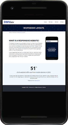
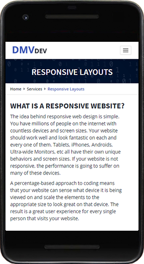
Note the differences in this side-by-side comparison of my website. First, you can see how the website would look on a mobile phone without responsive coding. The website simply scales down to fit the screen, leaving the menu basically unusable and the text unreadable. It would be up to the website visitor to zoom in enough on their device to click on things or read the tiny text.
In the second screenshot, you can see how the website looks with a percentage-based responsive approach. This is the way I choose to do things here on the DMV Dev website. An easy-to-use mobile menu expands downward when the toggle is clicked. The text is larger and easy to read. Elements on the page naturally tile downwards and provide a nice, fluid journey down the page.
Get in Touch
Is your website in need of an update to utilize responsive coding? I specialize in turning desktop websites into beautiful mobile user experiences. Let's make sure you make a great impression on all of your visitors.
